Horizon
Horizon
Horizon
Horizon
Title & End Credit Design
Title & End Credit Design
Title & End Credit Design
Title & End Credit Design


Client
Sailing For Impact
Role
Title Design
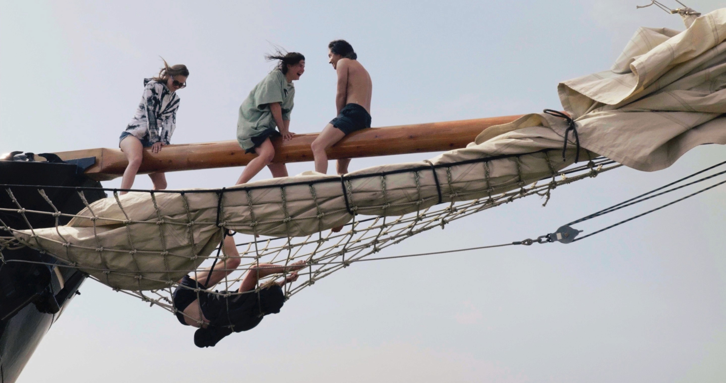
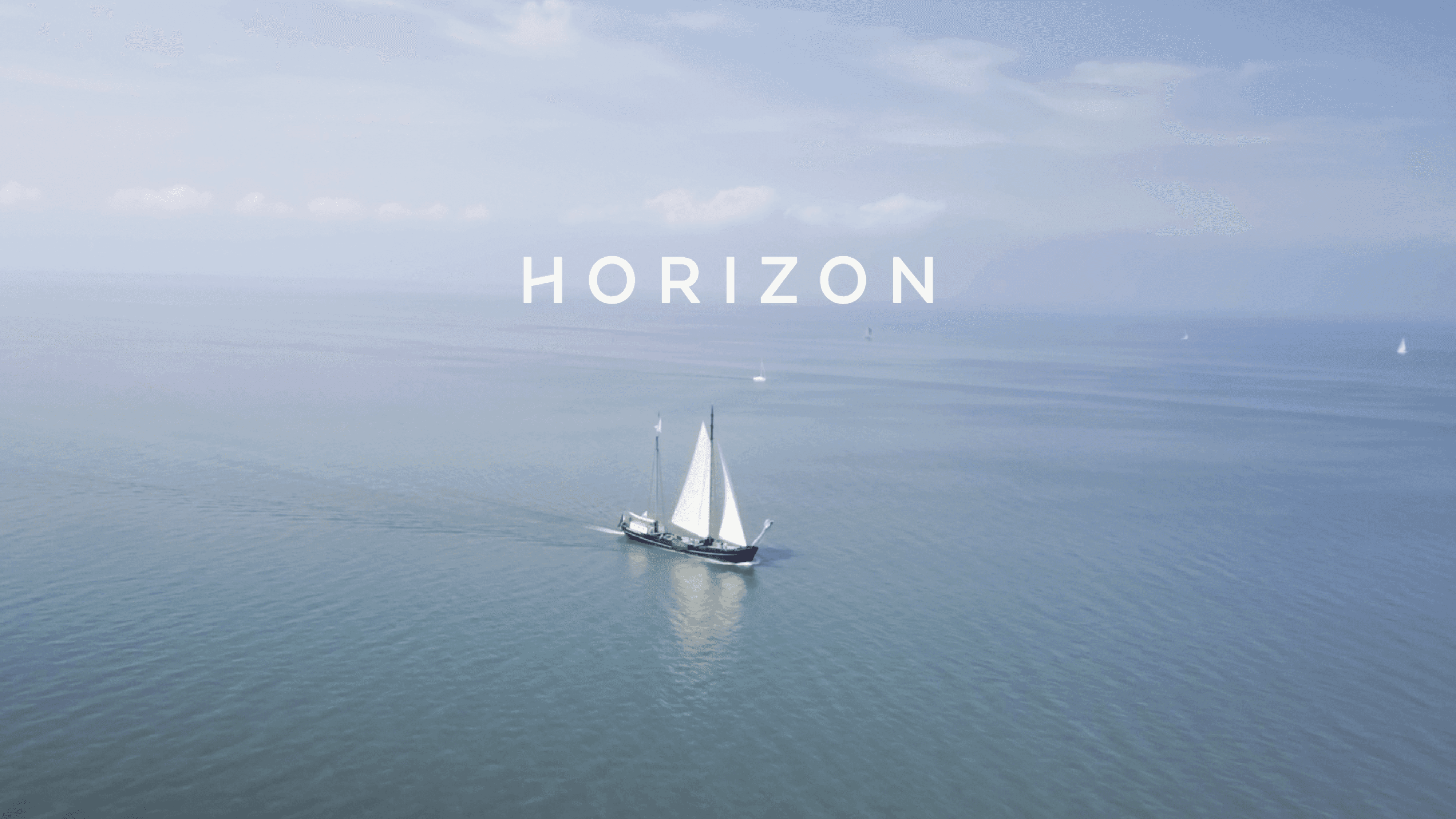
In collaboration with the University of Utrecht, Sailing For Impact presented the documentary Horizon. Based on the research of master student Marolise de Vrij, the documentary focusses on educational innovation by exploring the significance of ‘outside learning’ - an alternative approach to our traditional way of schooling. A venture that aims to alter the perspective of its crew.







We live and we learn
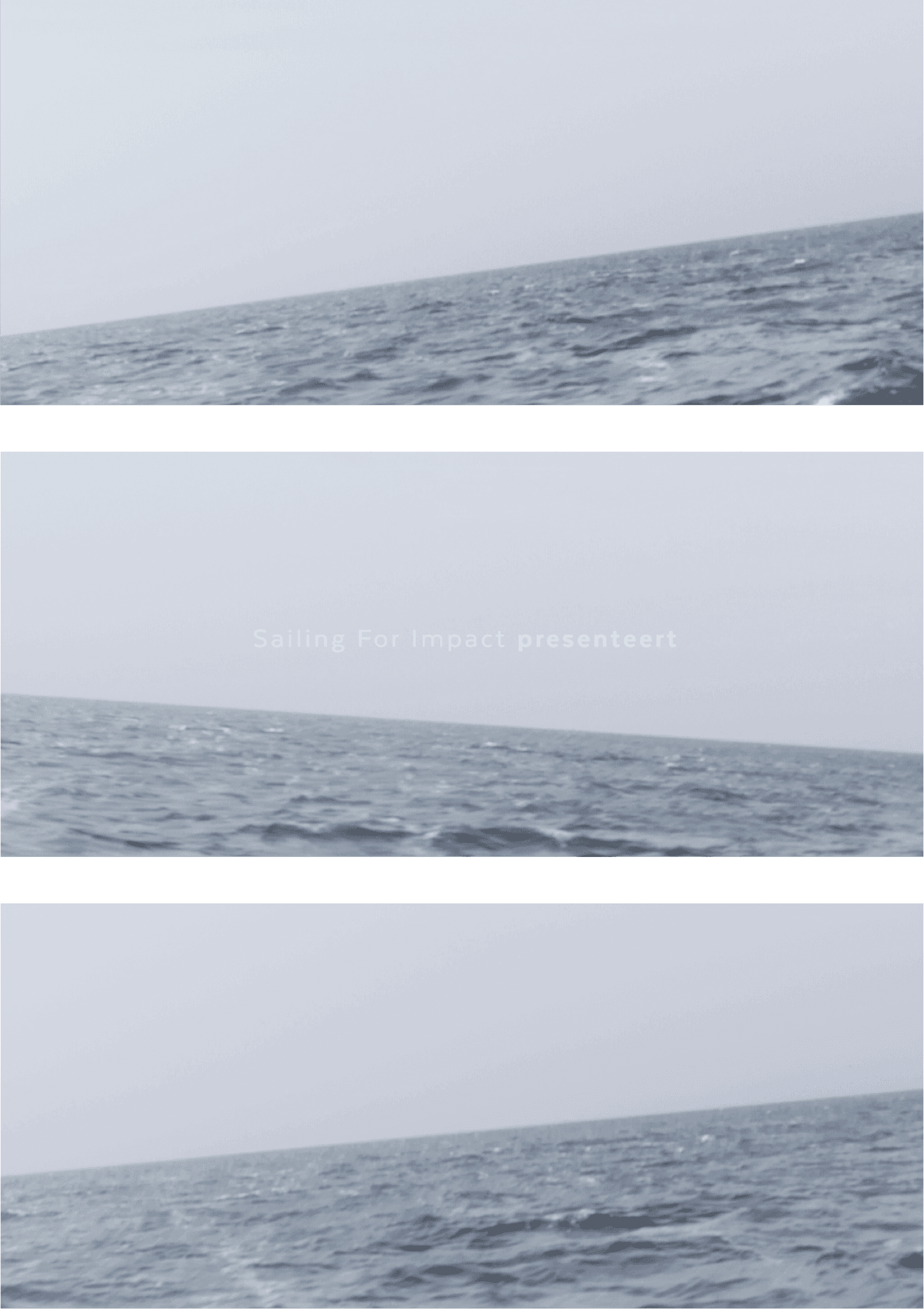
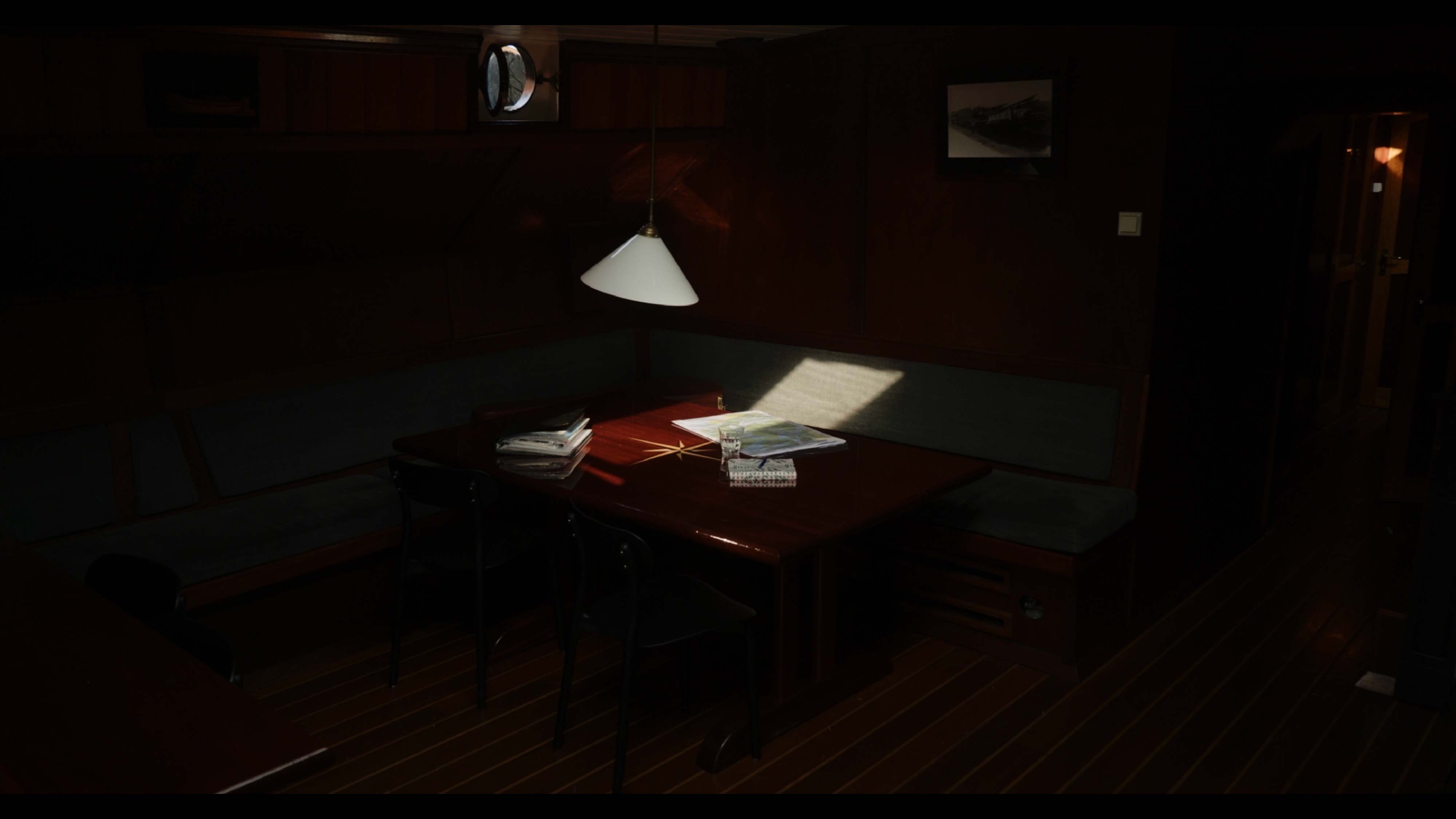
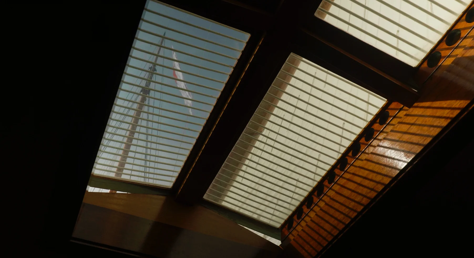
The title design for this documentary is entered around the theme of perpetual learning and growth, embodying the essence of constant development. I took into consideration the shots that were used throughout the narrative, as well as the conversations documented over the course of the film.
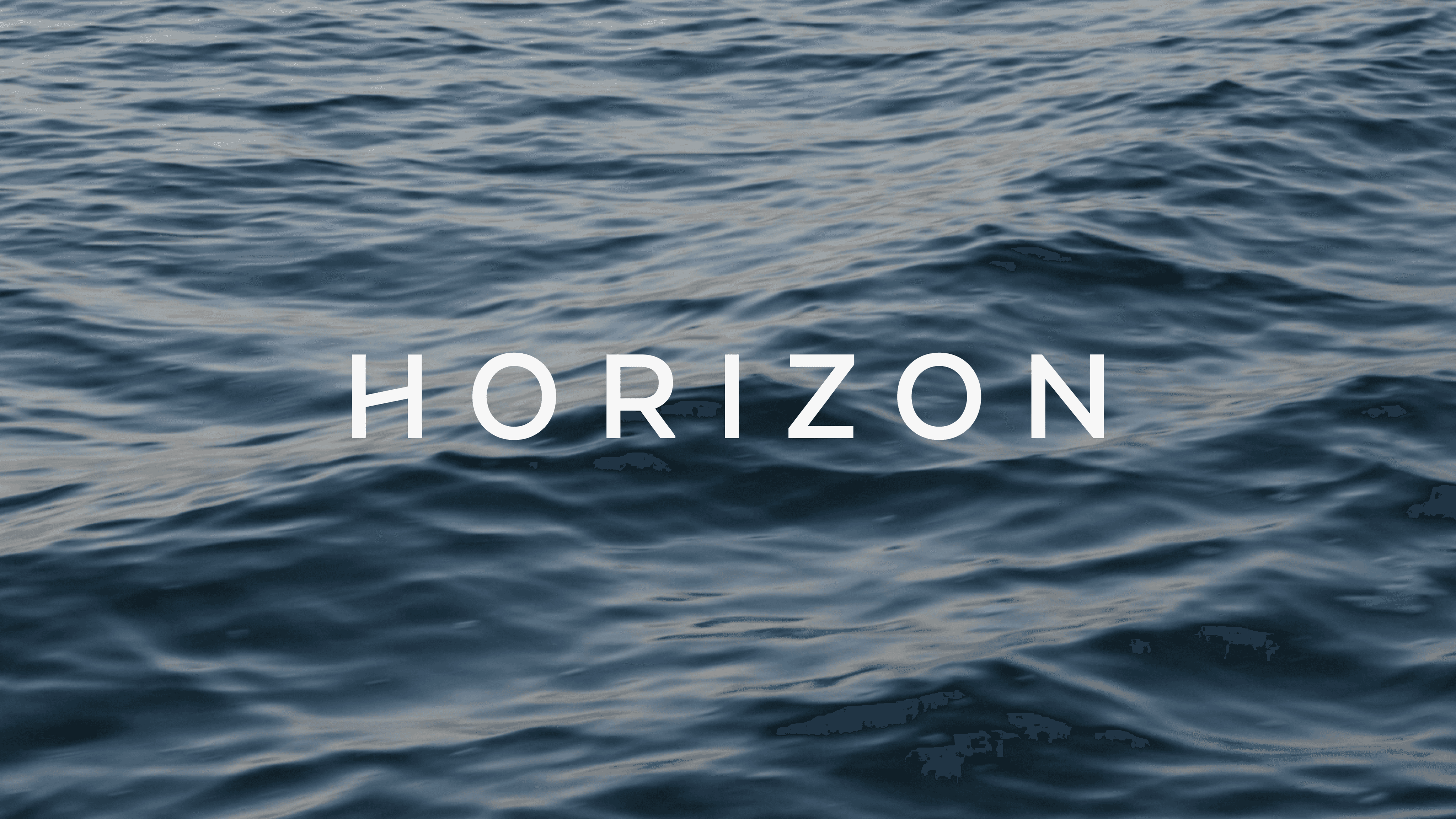
Conveying the message of continually living and learning, causing us to shift our view, the titles aim to reflect the wavering landscape captured on camera. Texta was used as a clean and simple font to underline the peace and quiet as experienced by the crew while on sea.
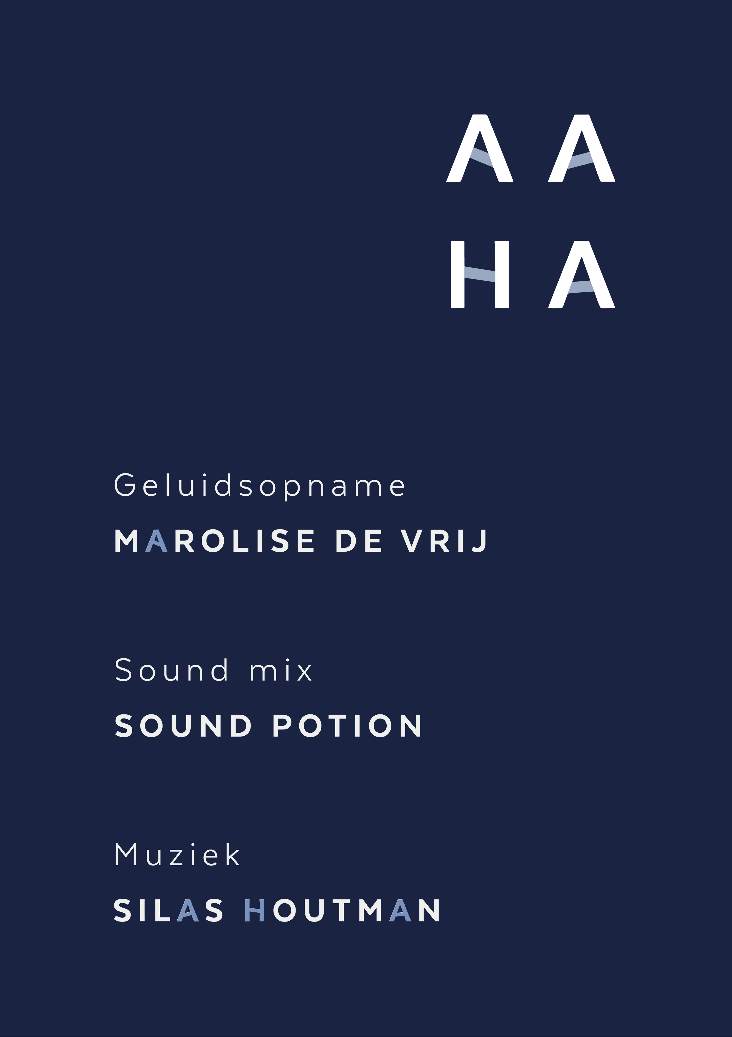
Within the font design, I incorporated a visual metaphor by altering the bars of the letters, symbolising the ever-shifting horizon of knowledge and perspective. This element subtly underscores the central theme and message of change and adaptation as we all navigate our own journey of learning and self-discovery. The visual motif is carried throughout the entire film, providing a cohesive representation of the film’s core message.
